
Navigating a duality of perception while delivering disruptive design.
British Brands
Brand Story
British Brands represents a collection of tobacco brands sold in global travel retail, each with its origins rooted in Great Britain.
The Challenge
To rejuvenate the brand group’s 2D and 3D design language, placing the Union Jack at its core. This posed challenges in establishing distinct brand ownership around a widely used national symbol, and in expressing the right side of patriotism amid divided perceptions of the flag.

My Responsibilities

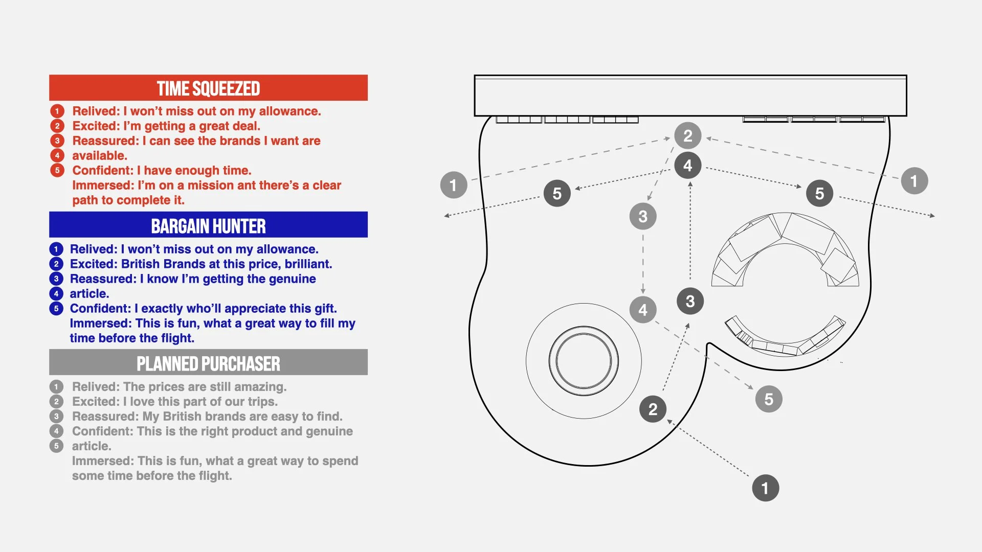
The Consumer
In developing our design approach and the overall layout of the environment, we focused on our target audience — predominantly British travellers abroad. Within this group, we identified three key user types: the Time-Squeezed, the Bargain Hunter, and the Planned Purchaser. Mapping these user types across the environment helped us better understand their behaviours and build a clear hierarchy of touchpoints to guide the design.
Three Distinct Concepts
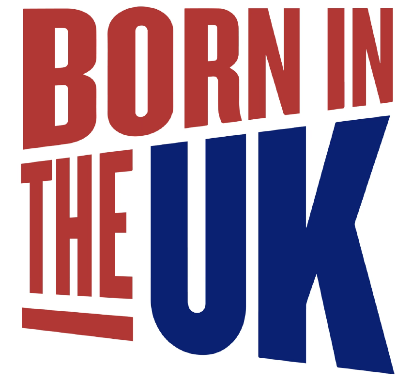
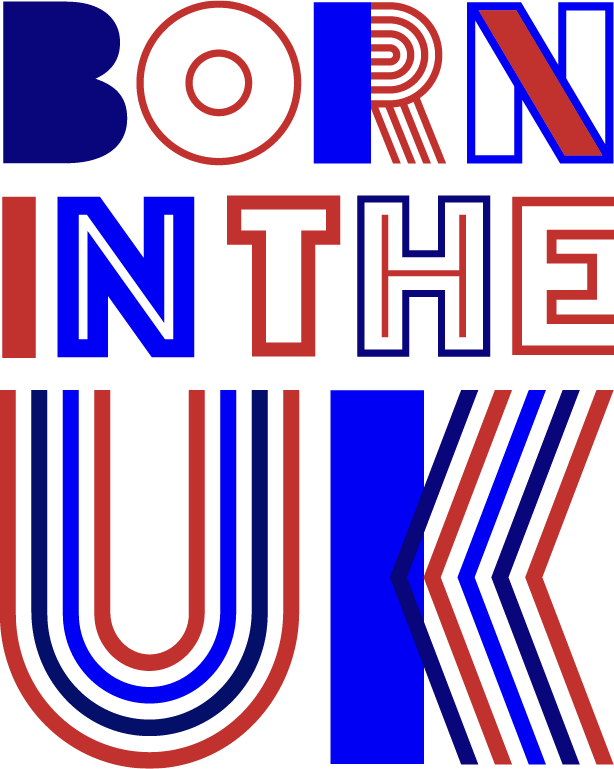
We developed three distinct design directions, each built around the Union Jack and the slogan “Born in the UK.” The first concept, Perspectives, explores ways to deconstruct the flag to create a sense of curiosity and engagement. The second concept, Diversity, celebrates Britain’s rich tapestry of cultures — shaped by its four nations and long history of immigration. The final concept, Heritage, juxtaposes Britain’s storied past with its modern identity, all infused with a touch of British humour.


The Chosen Concept
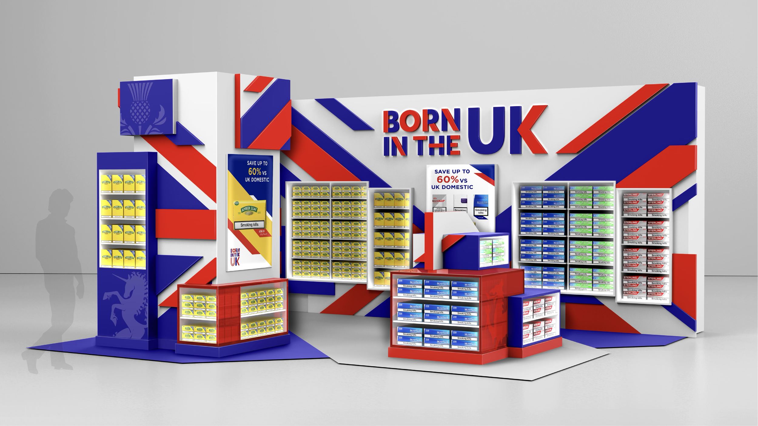
Diversity was chosen as the concept to take forward. It was further refined to create a more focused and cohesive experience — one that felt easier to navigate and visually less cluttered.

Design for Manufature
With the final design agreed upon, I produced detailed design intent drawings, which were then handed over to our manufacturing partners. At this stage, we also 3D printed a 1:26 scale model of the environment to help communicate the design and generate excitement around the project.

Adaptable Design Language
Building on the success of the first environment, we extended the design language to two additional airport spaces — one focused on signposting the brand group, and the other designed to accommodate a larger volume of stock.

